I don’t think anyone here would disagree with me if I said choosing paint colors is HARD. There are just so many options, and they usually look very different on the wall than they do on a little paint chip. Saying you’re “just going to paint it a neutral color” doesn’t make things any easier either…even though it may sound like giving up. Neutrals are hard to choose because their undertones are all over the place and they change so much from house to house, room to room, and even depending on the time of day. A neutral that looks great in your living room might look like the most awful color in existence in your bedroom, and just because you find a color you love in a friend’s house or online doesn’t mean it will look anything like that in your house.
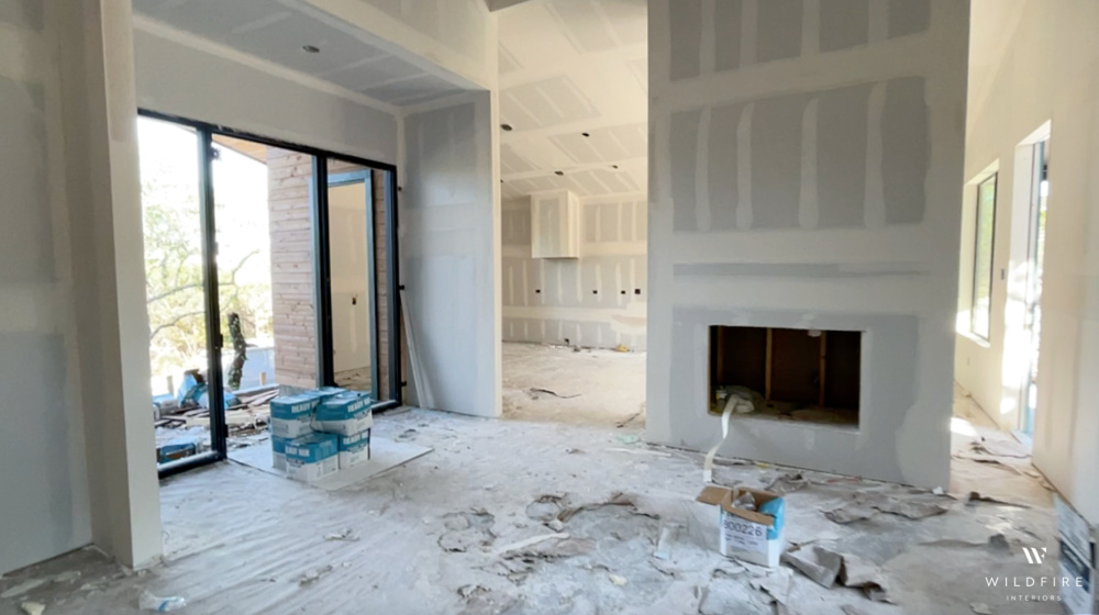
In our current house I went a little crazy with color. I love color, and my walls have been (or are) saturated greens, blues, oranges, browns, and purples. I’ve found that decorating those rooms can be challenging, and most of the things I put in them tend to be white, tan, or brown. Accessories should be fun, and mine aren’t…becasue all the “fun” is on the wall. So in the new house I am (mostly) taking the color off the walls and going very neutral. I’m actually a little nervous about it, but I think it’s the right direction. After looking at a lifetime’s worth of inspirational photos on Houzz I narrowed my neutral color choices down to three categories….
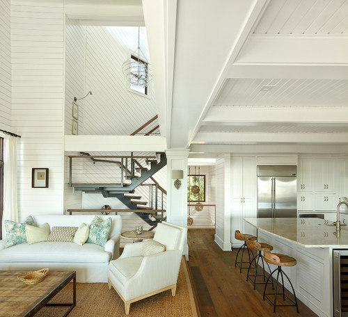
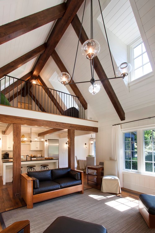
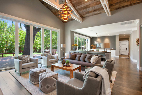
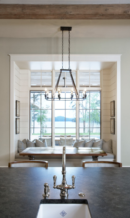
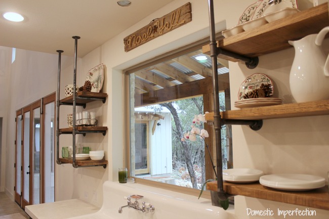
1. Bright White – Never in a million years did I think I would consider painting my entire house white. I love color, but every time a crisp white interior comes up I can’t help but smile. Add in lots of rustic wood, metal accents, and greenery, and you have yourself a no-fail combo. Years ago Adam and I planked our kitchen and dining room the I painted it bright white, and it’s my absolute favorite. You can do whatever the heck you want in that room and it all looks great. Then a few months ago I started to paint my master bedroom (which is mostly plain drywall) white and hate it. It’s just soooo boring. My conclusion is that walls with extreme texture (like shiplap or brick) look amazing in white…but white drywall is blah.
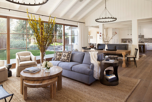
2. Light Neutral (but not gray) – I want a really light neutral, nothing too heavy, and not gray. I know gray is all the rage these days, but I just can’t get into it. I like a bit of brown in my neutrals… not enough to scream “builder-grade beige”, but enough so that it doesn’t look like cement on my walls. You also have to be careful to stay away from anything with a pink undertone or you’re going to end up with a house that immediately looks like it needs to be remodeled. Going greige is probably the best bet, and long as it’s still brown enough and doesn’t cross over into gray territory, or an off-white is good too….as long as it doesn’t end up looking too white on the walls and still defines the white trim. Basically, I’m neurotic and now you all know it.
3. Light Neutral with a Blue Undertone – This was probably the option I was initially most excited about. It was still neutral but still gave me a bit of (albeit slight) color fix, plus with all the wood in our interior blue is a natural choice.
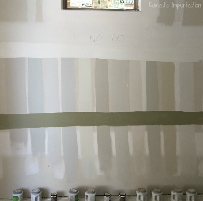
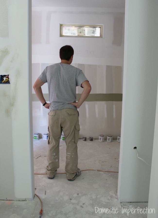
Having my three categories in mind, I set out to choose my samples. (I know, it’s a lot…a majority of them are leftover from choosing the exterior paint color.)
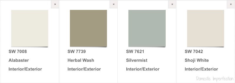
The vertical lines are the wall color samples I’m choosing from, and the horizontal ones are the colors I already have going in the house. The top white stripe is the trim color (Alabaster by Sherwin Williams) and the bottom dark green is the lower kitchen cabinet and island color (Herbal Wash by Sherwin Williams).
.
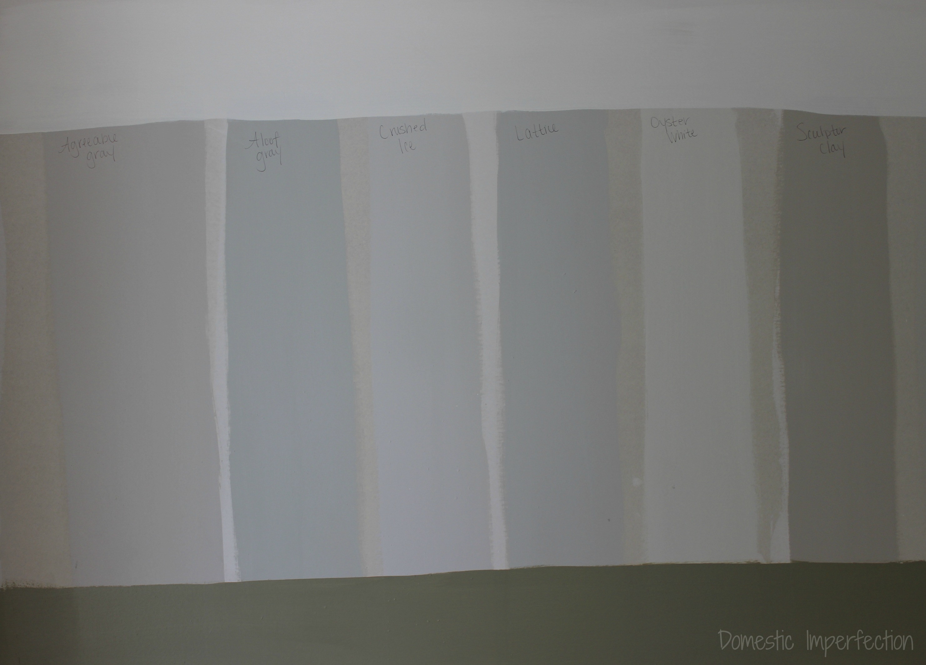
Here they are a little closer…
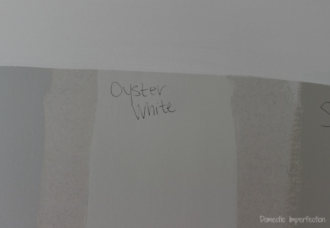
From left to right – Agreeable Gray (too pink), Aloof Gray (pretty), Crushed Ice (pretty but a bit too purple), Lattice (too purple), Oyster White (pretty), Sculptor Clay (love it in my guest room, not so much here).
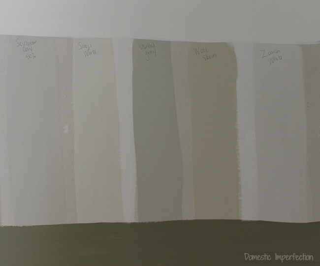
I narrowed it down to four choices in my head and then called over the husband to give me his take.
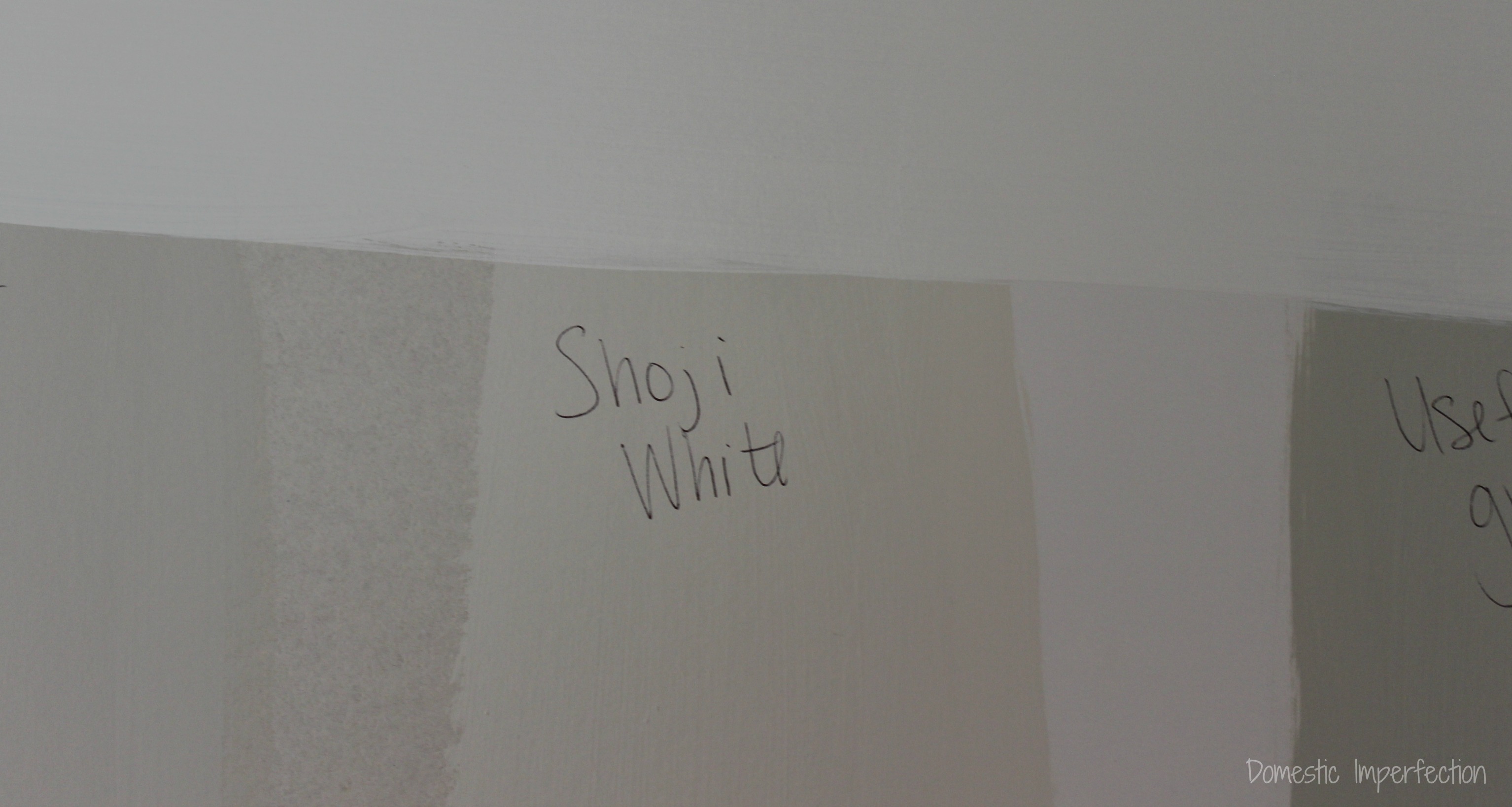
After grimacing at my cabinet color choice (I can’t wait for the apology when he loves the end result), he picked Oyster White and Shoji White, both of which were in my top four.
I painted a few more swatches of these around the house and stared at them for a completely reasonable amount of time (that’s a lie) before finally remembering the KISS principle, which stands for Keep It Simple Stupid. The outside of the house is painted Shoji White…we should just paint the inside the same color. Easy to remember, we can have one bucket of paint for touch-ups everywhere…simple.
.
So that’s our decision, Shoji White for the inside and outside of the house. We’re just a barrel full of fun and surprises, aren’t we? Real risk-takers, for sure.
.
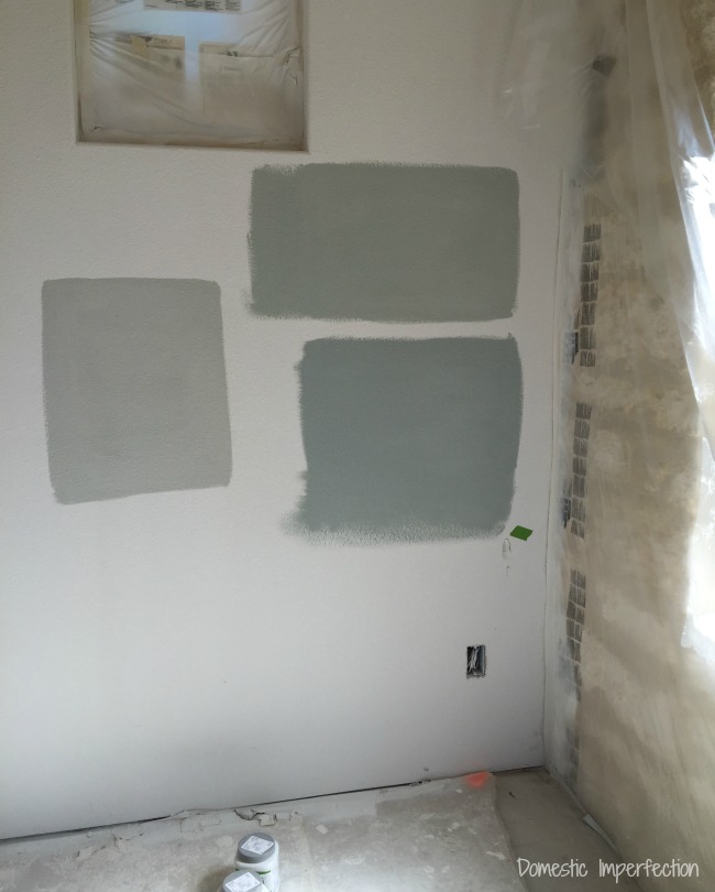
Hold on though, we’re not finished. We still have one more color to choose from, the color for the master bedroom and bathroom. This is the only room in the house getting color (for now), and I wanted a darker green or blue. A very grayed out, nuetralish green-blue, because I’m a super mature adult and all.
The grey square on the left is Aloof Gray, which was one of my top four from the last round. It was such a pretty blue-gray in the living room…but in the bedroom, it was ugly. Fugly, even. The top greenish color is Comfort Gray (one of the most popular colors around) and the bottom blueish one is called Silvermist. I liked both of these colors, but I had really wanted a blue in here, so Silvermist was the clear winner.
With that decision made, this is what the color palette in the new house looks like, so far.
Those swatches aren’t exactly what the colors look like in real life (Herbal Wash looks like diaper waste on my computer screen), but you get the picture. Can’t wait to see it all together!
While we are on the subject of paint samples, I recently tried a company called SAMPLIZE, and I’m a big fan. Samplize sells peel-and-stick paint samples that are large, repositionable, and about the same price as a sample pot of paint. They are shipped overnight and are super convenient…no mess, no storage, no commitment, easy to move around the house to see in every light, and can be ordered in just about every color from the big paint companies (SW, BM, etc).
I am so in love with your color palette! If I could redo my entire house I think I would have chosen the same. We recently bought a flip and every single wall is the same uninteresting, but also unobjectionable beige. Can’t wait to see the end result! I know those lower cabinets will look awesome.
Your colors are so NEUTRAL compared to mine! Haha. I have Carribean Blue in my living room (3 walls) and laundry room. The main wall in my living room is a really light gray with a very slight bluish tint because Hubby says the big tv looks better with a gray wall behind it. I totally agree and it breaks up the very very blue of the other walls. My kitchen is Dark Purple! (My FAVORITE of the whole house!) I loved it so much I used it for 1 wall in my bedroom too. (Best part other than the amazing happy color is that it was $5!) The other 3 are Dolphin Gray (kinda dark gray). My son’s room is just plain ol’ gray. (His choice. Boys are kinda boring sometimes when it comes to color :P) Daughter’s room is a Magenta-y purple on 2 walls and a teal blue on 2 walls. SO PRETTY & also each gallon was only $5!! And the part of the house right up the stairs is a lightish yellow (and the boring builder whitish color because we can’t reach the wall above the stairs :/ ) Painting is such a pain. Literally. I think we need to get one of those sprayers for our next house!
I’m so excited to see how your house comes together! I wish I could come over and help you do everything! :)
I love the colors you picked. I love color and when we first moved into our house I had color on all the walls but I slowly realized that all my colored furniture and accessories were competing with the wall color and everything was overwhelming and busy. Went back to white and now I can change anything else about the room I want, still have plenty of color and have a room that looks pulled together. Love seeing the progress!
I think your colours are very classy and grownup – but also will provide a lovely airy background for your textures, fabrics and accessories. I can’t wait to see it all come together. :) We are attempting to paint. First up is the ceiling, which is overwhelming because Sharon is disabled and I get dizzy every time I tip my head back. Then we want pale grey for the main area, but the samples we bought look horrible – purpley-bluish like old white-person skin that has lots of blue veins. Blech! So we have learned it needs to be a warmer grey. I like greige too, but S does not. Our office is light blue, and I love it.
Are you triple-sure about Herbal Wash? We painted big swatches on our great room walls and were sure it was the perfect neutral tan color…and then it went up as a very sagey green. Also, you probably already know this, but you’ll need two Shoji White touch-up cans, since interior paint is different from exterior paint.
I want the cabinets to be plainly and undoubtedly green, (without looking like something from a box of crayons) and I think Herbal Wash is perfect for that.
I love the Silvermist! Grey but with blue. I need something like that for my kitchen cupboards. SOOOO hard to find something here in Oz that is that tone. Good to see you and hubby are on the same page in colour liking!
While I don’t object to neutral colors, we’ve lived for at least 15 years in dorms or rentals where every wall was white & you couldn’t change it. Now that we have bought a house, I’m painting the walls bright & bold!! Perhaps in another 15 years I’ll be longing for white walls, haha.
Though I did just finish painting one small wall area light gray, and of course it ended up with a slight purplish tint. Not great next to the yellow decorations! One day I’ll find something a little warmer, but now that shelves are hung, we won’t be re-painting it any time soon.
Excellent choice. ☺I choose the same colours. Shoji white(ish as we have a different brand on) for our living room-kitchen-study-entry and very pale blueish-greyish for our bedroom. Before that, I had a light green living room-etc and a very dark brown, then very Facebookish blue in the bedroom. ☺
The painters actually gave me a second chance to change my mind over Shoji white(ish) as (in their opinion) the difference between the white ceilings and this could hardly be seen. (I always paint the ceilings white.)
Well, I stick (sticked?) to it no matter what and I was so right! The colour works perfectly with everything, is elegant but family-friendly. Rugs, textiles, decoration: so much freedom and room to play. :))
I’ve been thinking of repainting the interior of our home, but I’m hitting a brain blockage in picking the right colors. I like the idea of having white walls, however I just have drywall and I don’t think it’d be as visually pleasing. But I really love the “Light neutral with a Blue Undertone”, so perhaps I can give that color a go! Thanks for the help.
You’re so right! Choosing the right color is always so tough because there are so many different routes you can go to help create the perfect look. You give some really good tips here for deciding what colors would look best in your home. This post is really helpful, so thanks so much for sharing!
I love the neutral color scheme. Grey is my favorite color for wall paint, as I think it leaves so much room for a wide variety of room decor. Nice suggestions! Thanks so much for the info!


I am so in love with your color palette! If I could redo my entire house I think I would have chosen the same. We recently bought a flip and every single wall is the same uninteresting, but also unobjectionable beige. Can’t wait to see the end result! I know those lower cabinets will look awesome.
Your colors are so NEUTRAL compared to mine! Haha. I have Carribean Blue in my living room (3 walls) and laundry room. The main wall in my living room is a really light gray with a very slight bluish tint because Hubby says the big tv looks better with a gray wall behind it. I totally agree and it breaks up the very very blue of the other walls. My kitchen is Dark Purple! (My FAVORITE of the whole house!) I loved it so much I used it for 1 wall in my bedroom too. (Best part other than the amazing happy color is that it was $5!) The other 3 are Dolphin Gray (kinda dark gray). My son’s room is just plain ol’ gray. (His choice. Boys are kinda boring sometimes when it comes to color :P) Daughter’s room is a Magenta-y purple on 2 walls and a teal blue on 2 walls. SO PRETTY & also each gallon was only $5!! And the part of the house right up the stairs is a lightish yellow (and the boring builder whitish color because we can’t reach the wall above the stairs :/ ) Painting is such a pain. Literally. I think we need to get one of those sprayers for our next house!
I’m so excited to see how your house comes together! I wish I could come over and help you do everything! :)
I love the colors you picked. I love color and when we first moved into our house I had color on all the walls but I slowly realized that all my colored furniture and accessories were competing with the wall color and everything was overwhelming and busy. Went back to white and now I can change anything else about the room I want, still have plenty of color and have a room that looks pulled together. Love seeing the progress!
I think your colours are very classy and grownup – but also will provide a lovely airy background for your textures, fabrics and accessories. I can’t wait to see it all come together. :) We are attempting to paint. First up is the ceiling, which is overwhelming because Sharon is disabled and I get dizzy every time I tip my head back. Then we want pale grey for the main area, but the samples we bought look horrible – purpley-bluish like old white-person skin that has lots of blue veins. Blech! So we have learned it needs to be a warmer grey. I like greige too, but S does not. Our office is light blue, and I love it.
Are you triple-sure about Herbal Wash? We painted big swatches on our great room walls and were sure it was the perfect neutral tan color…and then it went up as a very sagey green. Also, you probably already know this, but you’ll need two Shoji White touch-up cans, since interior paint is different from exterior paint.
I want the cabinets to be plainly and undoubtedly green, (without looking like something from a box of crayons) and I think Herbal Wash is perfect for that.
I love the Silvermist! Grey but with blue. I need something like that for my kitchen cupboards. SOOOO hard to find something here in Oz that is that tone. Good to see you and hubby are on the same page in colour liking!
While I don’t object to neutral colors, we’ve lived for at least 15 years in dorms or rentals where every wall was white & you couldn’t change it. Now that we have bought a house, I’m painting the walls bright & bold!! Perhaps in another 15 years I’ll be longing for white walls, haha.
Though I did just finish painting one small wall area light gray, and of course it ended up with a slight purplish tint. Not great next to the yellow decorations! One day I’ll find something a little warmer, but now that shelves are hung, we won’t be re-painting it any time soon.
I so get your thinking through process because there is real truth in all that you say. Looks GREAT!
Excellent choice. ☺I choose the same colours. Shoji white(ish as we have a different brand on) for our living room-kitchen-study-entry and very pale blueish-greyish for our bedroom. Before that, I had a light green living room-etc and a very dark brown, then very Facebookish blue in the bedroom. ☺
The painters actually gave me a second chance to change my mind over Shoji white(ish) as (in their opinion) the difference between the white ceilings and this could hardly be seen. (I always paint the ceilings white.)
Well, I stick (sticked?) to it no matter what and I was so right! The colour works perfectly with everything, is elegant but family-friendly. Rugs, textiles, decoration: so much freedom and room to play. :))
Colors look great! Nice choices indeed. Love everyone of it.
I’ve been thinking of repainting the interior of our home, but I’m hitting a brain blockage in picking the right colors. I like the idea of having white walls, however I just have drywall and I don’t think it’d be as visually pleasing. But I really love the “Light neutral with a Blue Undertone”, so perhaps I can give that color a go! Thanks for the help.
You’re so right! Choosing the right color is always so tough because there are so many different routes you can go to help create the perfect look. You give some really good tips here for deciding what colors would look best in your home. This post is really helpful, so thanks so much for sharing!
I love the neutral color scheme. Grey is my favorite color for wall paint, as I think it leaves so much room for a wide variety of room decor. Nice suggestions! Thanks so much for the info!